CORPORATE IDENTITY
“Corporate identity is like a fingerprint, expressive evidence of the unique values, focus and nature of an individual or organization, enhancing recognition through consistent visual clues imprinted on everything it touches.”
Logo design for family-owned vineyard
The concept for this logo was inspired the owner's description of his four children as his "petits cailloux" (little pebbles) and an ironic reference to the size of the boulders that had to be shifted in order to prepare the ground for the vineyard.
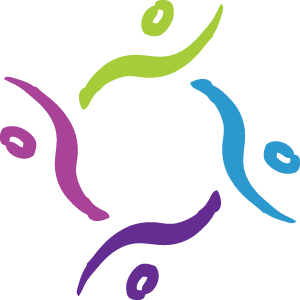
logo design for group facilitator
A sense of the importance of both individuality and group dynamics shaped the concept for this logo for a group facilitator.


Logo Design for Loss and Living Outreach Program
ORA is a Maori word which means “life.” The ORA Loss & Living Program is about piecing broken fragments together to renew life. The logo uses the interplay of positive and negative space to represent the veins of a leaf, creating channels that life may flow through. Fractured shapes and colours are also evocative of stained glass, which allows the light to shine through its broken pieces. Other elements of the logo represent diversity and harmony; the asymmetric design and pointed shapes create a feeling of growth and movement. Colours range from dark green to light green representing the movement through grief and loss to the next season of renewal. The composition of the image also denotes shelter (like an umbrella overhead, or the feeling of gathering in the shade of a large tree).
ADDITIONAL EXAMPLES OF corporate identity design:


NOTE: Some examples of work shown on this page were developed during my role as Senior Designer at Griffintown Media.